EM

Travel abroad easier
A B2C Mobile app for trip planning and management
UX
UI
Mobile App

The problem
People struggle with planning a vacation
and sticking to plans.

User Research
people who travelled
in the past year
were interviewed
15
was the range of ages
18-61
major personas:
group of friends, couples,
families, business travelers
4

What do users do?
Sort attractions to days
roughly estimating / by gut feelings
Pick attractions
manual searching and saving
Choose a destination
sometimes needing research
On the go changes
sometimes holding off the plans
Navigate to each attraction
one by one
Create a route
between each two attractions

Reasons & implications of the problem
INSIGHTS FROM USER RESEARCH
No one stop shop requires manual alternating between several apps
feeling exhausted and
overwhelmed
Lack of automation requires manual picking and sorting of attractions by days
planning inaccurately, having delays and feeling disappointment
Lack of personalization in trip plan causes visiting generic, mediocre attractions
feeling fear of missing out
unexplored, better options

Insights & conclusions for the solution
INSIGHTS FROM USER RESEARCH
Users use PC/Mac & mobile to actively plan, but mostly mobile to write notes and recommendations.
We'll design mobile first.
Users plan together, or share their plans with each other after planning.
We'll suggest users to invite friends and contacts to share their plans.
Users count on ratings from other apps, such as Google Maps and Tripadvisor.
We'll use their API to present external ratings.
Users enjoy to virtually experience places where they can visit.
We'll use large, appealing images for landscapes, food & drinks
Users wanted a sense of control over planning, so they could create the perfect trip for them.
We'll provide them with rich choice via onboarding, by which their trip plan would be created.
Users trust recommendations of people of their same persona / category.
When showing recommendations, we'll also show which chosen filters they are based.

Market Research
I studied direct & indirect competitors in the following domains:
trip planning, maps & navigation, schedule management, weather, food and accommodation services.
Presenting Value
-
A quick, clear onboarding process
-
A complete, personalized itinerary in the end of the onboarding.
Enhancing Return to app
-
Note users with valuable last-moment information
-
Let users share travel stories with each other by using Facebook login.
Monetizing
-
Group planning / smart route as a premium features.
-
Suggest in-app booking services for accommodation, restaurants & shows.
Providing a delight
-
Send users a summary video with their videos and photos after a vacation.
-
Send an annual fun analytics (Spotify Wrapped) or trivia (RiseUp)
Micro-copy
From "Street eating" to "Fine dining", the terminology and categorization were polished to be non-offensive but clear.
Layout
From Spotify to Facebook, a layout was created using best practices of menus, maps, lists and images to ease complexity.

Site Map Architecture
Home
Plan Trips
Itinirary
Notes & Tasks
Explore Destinations
Travel Stories
Saved Stories
Explore & Filter Stories
Profile
My fellow travelers
My Travel Stories
Personal Info

Wireframing

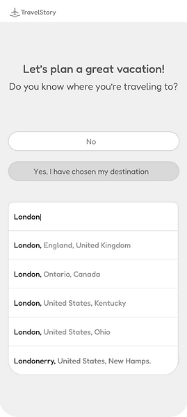
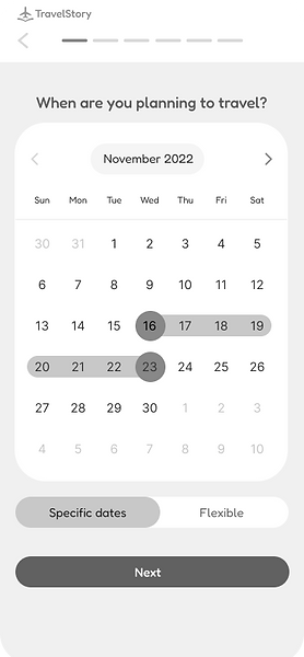


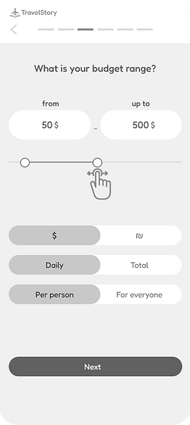


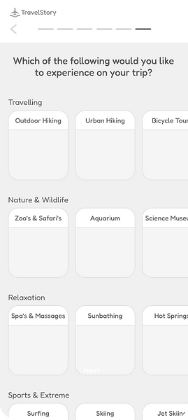


Usability testing
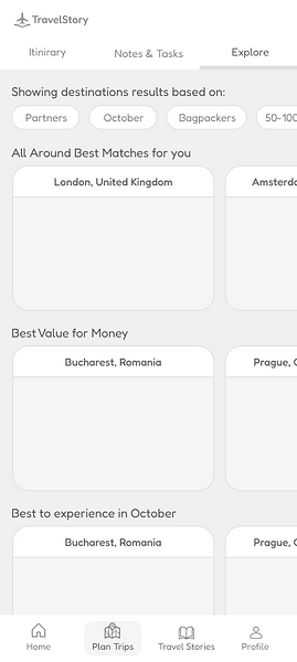
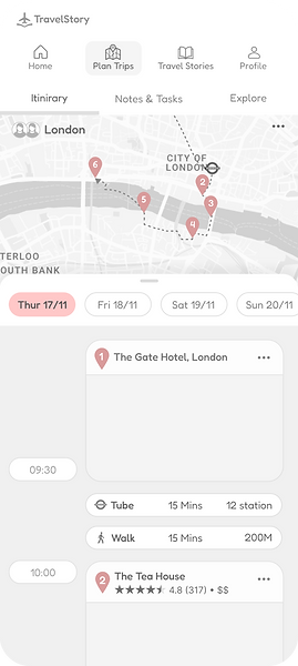
Users showed better orientation via 'think aloud' tests & quicker time responses thanks to the following:
Physical separation of the two-level menus.
1
2
Bottom sheet's hierarchy change.
3
Before
After
2
1
3

2
1
3

Design concept & inspirations
CREATING THE DESIGN
The design concept of star-travelling was chosen, minimizing the planning of a vacation on planet earth to a non-issue.
Pain point
Motives for design
Inspirations
Users were exhausted from inefficient, manual planning.
Smart & automated


Users felt planning became an unenjoyable task.
Fun, explorable, cinematic


Mini Design System
CREATING THE DESIGN
Typography
Staaliches
Headlines
Sora
Free text
Color Palette
#54E4A9
#8A93FF
#30266C
#030230
Buttons
Primary
Secondary
Tetriary
Universal Icons
Intergalactic Icons


Illusrations


The Solution

Welcome, Major Tom!
An easy login page which allows Facebook connect,
so friends can invite each other to mutual trip planning once they had gone past the onboarding.

All aboard!
Better orientation in the process thanks to a progress bar.
Faster form filling by using a slider instead of typing.
Allowing multiple preferences for an answer using a toggle.


What do austronauts like?
Those will help the user receive a more personalized trip.
Vertical scrolling between categories, horizontal scrolling within categories. Easier comprehension of terms by using mental models within the images alongside similar shot composition.

Unexplored galaxies await
Based on your preferences from the onboarding stage, here are our recommendations for where to go, sorted by different decision factors.
Your vacation is a click away!


An out of this world trip!
All the places you can go in your destination, sorted by days, including transportation methods and time estimation for each. You can still edit the attractions or change their order until you consider it perfect.

10, 9, 8... Launch!
Navigate to each attraction using your smart watch,
so you won't even have to pull out your phone.

